Thursday, 3 March 2011
Thursday, 20 January 2011
A2 Media Studies Music Video Evaluation
In what ways does your media product use, develop or challenge forms and conventions of real media products?
We have kept within the genre characteristics for ‘Alternative Rock’. We feel we portrayed our genre in the correct way by use of natural looking lighting, costumes of the couple and editing techniques. This theory was also backed up by our classmate’s reviews. When we presented our final edit of our music video in front of them. We felt our print products (digital pack and magazine poster) that were both designed on Photoshop fit in with our Alternative Rock theme. The colours are very vibrant (yellow), which is a reflection of the band’s songs, which are generally uplifting.
- Research conventions of artist.
After researching the band thoroughly, a re-occurring narrative appeared that being a romance/love story. The band had beautiful locations for filming their videos for example Ireland. Lip-syncing was always contained within The Scripts videos showing a leading male role. Another key feature is the band performance, as the audience would see them perform in real life. We have three out of four of the artist’s conventions.
- Challenging Conventions.
As a group we decided it was not necessary to use band performance, as the love story was the main feature. After feedback from our classmates it proved as no one had picked up on the fact it was missing. Our target audience is teenagers/ young adults and Script fans. We tried to set this up through the use of young actors/actress and young costume.
- Theories.
We have used Andrew Goodwin’s (an established media theorist) theories. Who has acknowledged that there is a relationship between lyrics and visuals. We have used a romance story to portray this and at times within the music video supported the visuals to specific words.
How effective is the combination of your main product and ancillary texts?
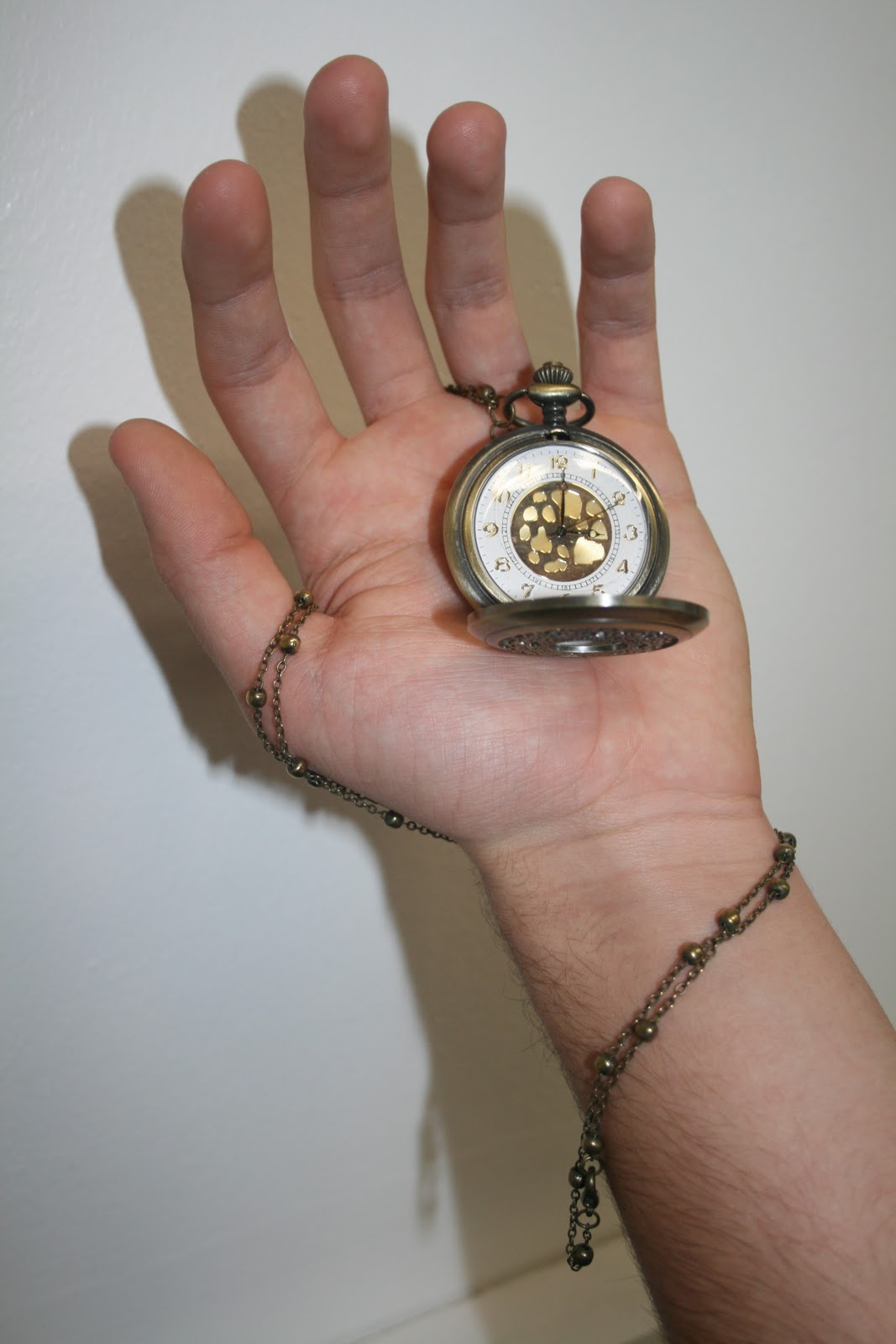
Our promotional packages fit together well and fit conventions as they have a theme running through. Both the magazine advert and digi-pak link together by showing hands holding the same pocket watch which represents time standing still until he meets his loved one. This is the main focal point in both products this was taken from our research of The Scripts past album artwork, that they always have a main feature in the foreground.
We have taken on board the fact the artists such as The Script use one font across all their products as a way of making them more recognisable, which then creates a brand identity. We have followed this concept and used the font (Skia) across our work as its simple and very easy to read. We have tried to make our promotional packages realistic to real media products, by the layouts we have used and the positioning of logos and information.
What have you learnt from your audience feedback?
As a group we set up a questionnaire to effectively collect audience feedback from what they expect to be featured in a Script video or videos of the Alternative Rock genre. Having a narrative within a music video was a popular choice from our audience feedback, which we then included in our own.
Whilst we were editing our video we were continuously receiving helpful feedback from our teachers and students about changing effects or clips to delete from certain scenes. Once we had a completed version of our music video we presented it to our media class at which they wrote critical feedback for us to take back and use. Some positive thoughts were “good use of light from the sun and using its rays” and “I liked the use of surroundings such as the traffic lights and Ironbridge”. We received some negative feedback also for example “perhaps too many different locations”.
I have looked into some audience theories, such as Blumler and Katz and their theory of uses and gratifications, which was published in 1974. This theory describes ways that text is used for different purposes for example personal relationships which could be a way of portraying emotions and personal identity where you could find yourself in the same position of the texts. Both of these relate to our music video as the audience can see the clear relationship between both actors in the video. We have displayed the emotion of heartbreak into our video so our audience could identify with their past or current feelings whilst learning values perhaps by seeing themselves reflected in the video.
How did you use new media technologies in the construction and research, planning and evaluation stages?
For our research we used ‘You Tube’ (www.youtube.com) to look into the conventions The Script have used in they’re past music videos. This helped up plan locations, props and narrative for our own video. We also studied the band own website (www.thescriptmusic.com)
We kept all our work we had produced for example artist research, DVD cover analysis and many more on ‘Blogger’ (www.blogger.com) to keep ourselves organised. We were able to write our thoughts on how our project was going as well as putting pictures related to our project.
We downloaded the MP3 file ‘The Man Who Cant Be Moved’ By The Script legally from Itunes. By doing this first were then able to add separate video clips and start editing before the rest of the video had been filmed.
Digital cameras and a tripod were our necessary media technologies to film and get a steady professional look. The lighting used within our video were all natural and the camera we used caught the light well for example the sunlight’s rays in Ironbridge at 0:04
Our music video was edited using ‘Final Cut’ on the Macs at college as it was recommended to use, as there are hundreds of effects and sounds available which was also available to use in our spare time. By using this programme we were able to lip sync our video successfully. Some effects were needed for certain parts of our video.
We used digital cameras to take pictures for our magazine poster and digi pack, at which we edited further on Photoshop to get our final design that we felt was good enough for our project.
We were previously criticized for using images on our digi-pak from the Internet so Photoshop played a key role when it came to designing our digi-pack as it allowed us to use different images from varied sources to design a cover that we felt came together well in the end and created a cartoon feel as we have planned. We completed this look by using effects such as drop shadow, gradient overlay.
As our group wanted to create a professional feel to our music video we decided to use a green –screen at which we hired independently outside of college. It was fairly easy to set up and use which later on paid off, as we were able to use different backgrounds for example Ironbridge with the same front image of our lead role lip-syncing.
We used the social networking sight ‘Facebook’ (www.facebook.com) to upload our music video on to increase additional comments audiences outside of college.
Monday, 10 January 2011
Thursday, 11 November 2010
Digipak

I have been researching into digipak covers for more of an insight as to how to design our very own. I have used The Kooks because they are the same genre as The Script, the band which we have been promoting.
The mise-en-scene is quite simple just using a plain white setting; this makes the band stand out against the white background. The band members are positioned on the front cover as you would perhaps expect to see them perform on stage, with the drummer being at the back. We get to see the band in action on the front cover as there are close ups of the guitar players, long shots of the drummer are also used.

Above is the album cover for The Script's first album released in August 2008.
A digipaks main purpose is to promote the band/artist. Therefore on my digipak we shall have a consistent recognisable band logo similar to that of ‘The Script’ which has been used on many of their products, for my digipak and magazine advert.
The Script have not previously featured the band members on the front of their albums which could be because they don’t feel it is necessary as the band’s name and logo is popular enough to sell to the audience by itself.
On the back of my digipack we shall have a track list of all the songs on the CD, this is a very common feature on most album covers and that of my chosen genre of music for example ‘The Killers – Hot Fuss’, ‘Bloc Party – A weekend In The City’ and ‘Arctic Monkeys – Favourite Worst Nightmare’ all share this characteristic.
The mis-en-scene for my digipak is a quirky computerised style similar to ‘The Script’. We have used yellow and grey as the two main background colours, the tone of yellow really helps to make the album stand out. We have chosen to have the same colour scheme run through the whole digipak as seen on the front cover as it will look good visually.
 Here are my groups rough drafts for our Digi-pak and poster for 'The Script - The Man Who Can't Be Moved.'
 4th November 2010.

Here are some images of my group editing our digipak and magazine advert using the Macs.


This is our second draft copies of our digipak and magazine advert for The Script.
We had to change the image of the rowing boat to an image that we had taken ourselves.

Final magazine advert.

Here are some of our own images used on the Digi-pak.

Here is our final Digipak cover including all our own images.


Filming using the Green-screen.
Green-Screen

Image from: http://fada.kingston.ac.uk/study/study_facilities.php
Green-screen also known as blue-screen, colour keying and CSO (colour separation overlay).
This method was developed in the 1930's. A blue screen was favored for years until more recently because green helps retain detail when using digital cameras. Green also requires less light to be needed.
The use of a green screen has become dominant for film special effects. Advantages for using a green screen over blue is that for outdoor filming the sky wont be replaced in the process. Blue and green are used as the background colours because they are considered to be the least like the skin tone colour. You commonly find this technique used today for weather forecasts and in the entertainment industry.

Here is photographic evidence of my group and I using the green-screen at which we borrowed from our own sources.

We only used the camera,tripod and green-screen for this filming session including our costume from the original footing.

We used the computer for the songs lyrics whilst Ryan was performing.

We repeated many scenes from different angles and distances.


This is the picture that we are going to use within the music video to show the couples relationship stages.
Wednesday, 10 November 2010
Update on project.
So far our project has gone to plan as we have followed our product schedule carefully. We have had a few technical troubles throughout editing. Capturing footage at times set us back as it didn't save, we also ran out of memory space on the Apple Macs therefore had to transfer all the footage onto another member of the groups disk space, this held us up slightly. Also because we decided to use the green-screen we had trouble at times as the foreground image would appear blurry.
We also made a journals to record what we were doing with our time, showing the stages of our print texts.
Here is the link to our journal video uploaded to Youtube.
Here are some of the pictures that we produced but decided not to use.


Monday, 8 November 2010
Cast, Prop & Costume List

Actor - Ryan Topping
We needed cast members to be willing to give up their free time, so as a group we decided we should use members of our media class to help with the situation. Ryan is a member of our very own group so it works well as we can use our media lessons to go out and film until we get the scenes we need. Ryan is the perfect person to take on the lead male role in our music video as we needed a young male who would represent well being in a young loving relationship.

Actress - Briony Lake
Prop List

Costume List
- Converse All Star Shoes - To fit in with the 'Indie Rock' genre.
- Ripped Jeans - Young trendy bottom wear which also fits into the genre well.
Here are a couple of images from google to portray an example of the costumes used in our film.


In the video the female protagonist is wearing a white sleeveless Jack Wills top, we are aware that if we were in the industry we would have to make sure that there are no legal issues that we may face by including the logo.

Male Protagonist:
We decided to have our male character wear a pair of jeans and a simple hoody garment. This is a average outfit which makes him look like an ordinary male member of the public, this helps the audience to possibly relate their lives with our male protagonist's situation.
Location Report

The Ironbridge
We have made a group decision to base our music video at The Ironbridge in Shropshire. It is a famous landmark by the River Seven. We chose this location, as it is a fitting location for our song ‘The Man Who Cant Be Moved’.
We chose this because the Ironbridge has romantic connotations as a place for a love story as many of The Scripts videos insinuate. It is a good focal point for in the video.
To travel to our film was easy as one of the member of the media group can drive therefore we could transport our props,costumes and anything else needed safely and at any time we felt it neccessary to go out and film.

Our pictures taken from our location visit.


Location Pictures Using Google Street View.


Questionnaire
1. Are you male or female?

2. How old are you?

3. Are you a fan of music videos?

4. If yes explain why..
5. If no explain why..
6. If yes which music videos do you remember?

7. What genre of music do you prefer when watching music videos?

8. Which do you dislike?

9. What themes would you expect to see in a rock music video in particular?

10. What music channels do you like to watch music videos on?

11. Are there any music tracks in the rock genre that you don’t enjoy without the video?
Please specify
12. Within music videos do you prefer?

13. Do you like music videos that are?

14. When was the last time you bought a Digipak (Music DVD)?

15. Have you bought any music records by The Script?

16. What would you expect from a music video by The Script?
Please specify
Subscribe to:
Comments (Atom)