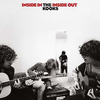
I have been researching into digipak covers for more of an insight as to how to design our very own. I have used The Kooks because they are the same genre as The Script, the band which we have been promoting.
The mise-en-scene is quite simple just using a plain white setting; this makes the band stand out against the white background. The band members are positioned on the front cover as you would perhaps expect to see them perform on stage, with the drummer being at the back. We get to see the band in action on the front cover as there are close ups of the guitar players, long shots of the drummer are also used.

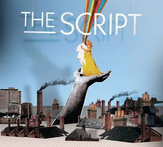
Above is the album cover for The Script's first album released in August 2008.
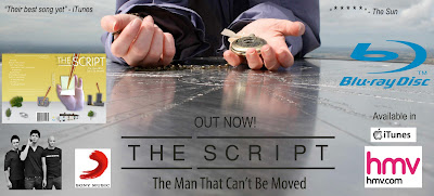
A digipaks main purpose is to promote the band/artist. Therefore on my digipak we shall have a consistent recognisable band logo similar to that of ‘The Script’ which has been used on many of their products, for my digipak and magazine advert.
The Script have not previously featured the band members on the front of their albums which could be because they don’t feel it is necessary as the band’s name and logo is popular enough to sell to the audience by itself.
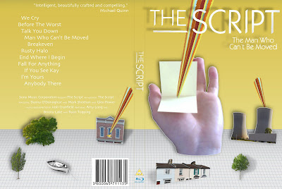
On the back of my digipack we shall have a track list of all the songs on the CD, this is a very common feature on most album covers and that of my chosen genre of music for example ‘The Killers – Hot Fuss’, ‘Bloc Party – A weekend In The City’ and ‘Arctic Monkeys – Favourite Worst Nightmare’ all share this characteristic.
The mis-en-scene for my digipak is a quirky computerised style similar to ‘The Script’. We have used yellow and grey as the two main background colours, the tone of yellow really helps to make the album stand out. We have chosen to have the same colour scheme run through the whole digipak as seen on the front cover as it will look good visually.
 Here are my groups rough drafts for our Digi-pak and poster for 'The Script - The Man Who Can't Be Moved.'
 4th November 2010.

Here are some images of my group editing our digipak and magazine advert using the Macs.
This is our second draft copies of our digipak and magazine advert for The Script.
We had to change the image of the rowing boat to an image that we had taken ourselves.
Final magazine advert.
Here are some of our own images used on the Digi-pak.
Here is our final Digipak cover including all our own images.


No comments:
Post a Comment